The following are features available in the Graph Properties Dialog box, which can be accessed by the user by moving their mouse within a Results View, then right click on the mouse and select Properties from the pop-up dialog. The properties that can be edited in the dialog are only related to the Results View they were selected.
Note: A user right clicking on a graph view will take them to the Graph Properties dialog, and a user right clicking on a table view will take them to the Table Properties Dialog.
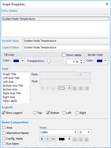
A list of the output variables that are currently included in the Results View and how they will be displayed within the Results View legend. By selecting one of the output variables, the name appears in the Variable Name field and the Legend name field, which can be edited. The name displayed in this field can also be changed by selecting or de-selecting options for parameters within Name Composition.
Allows the user to change the text representation of the variable name.
Allows the user to change the text representation of the legend name. For example, the user may want to shorten the name so that it fits better within the legend and the legends location on the graph.
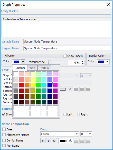
The color for the output variable selected will be shown. To select a different color select the chevron and the options for colors shown below will be displayed. The user can select from colors on the "custom" tab, which will be the current tab, or the "web" or "system" tab. By selecting a new color, it will automatically be associated with the output variable.
Note: There is not a "save" button on the dialog.
Allows the user to change the transparency of the display for the selected output variable. This feature may be useful for certain graph types more than others. The user can either adjust the transparency using the slider bar or they can increase or decrease the transparency % by selecting the up or down chevrons or they can enter a direct value.
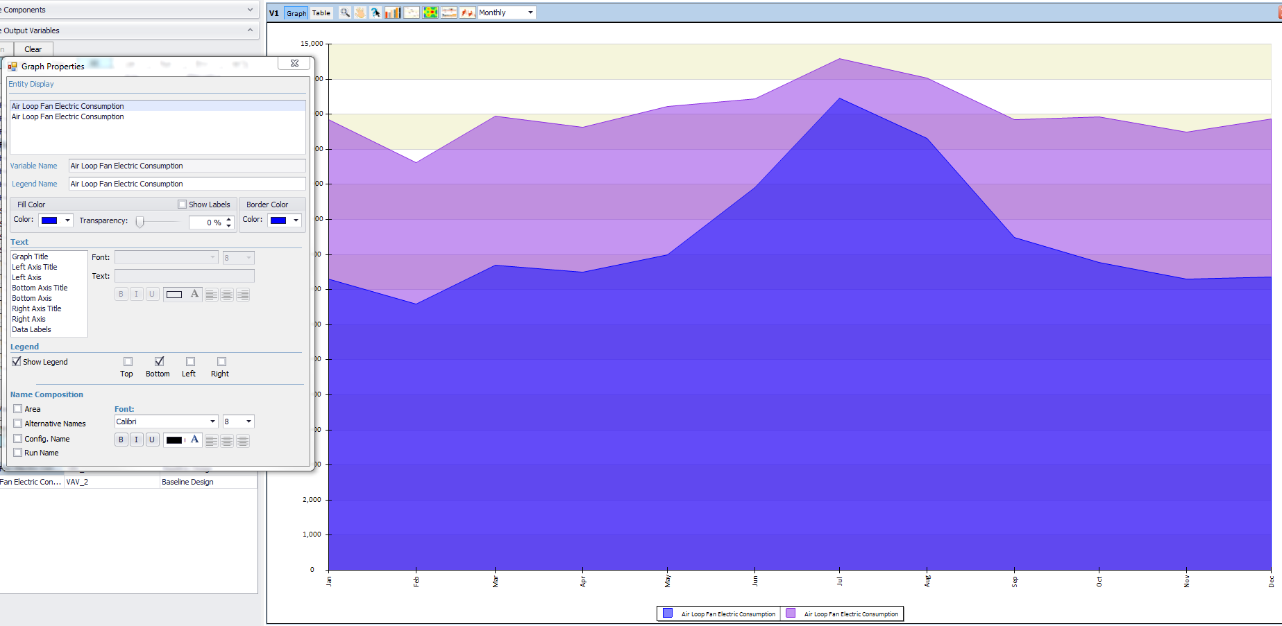
Note: If multiple output variables are associated with a graph view that is being displayed as an area chart, Simergy by default will incorporate transparency on the output variables, so that initially all of the output variables can be seen (image below).
Provides the option to turn on labels for the current output variable by selecting the checkbox. The label values will be shown at the middle of the output variable selection, and currently the user does not have control over the location, they just have the choice of displaying or not displaying the label values.
Note: Show labels only affects the output variable selected, not all of the output variables in the view. If the user wants to display labels for the other output variables they will need to select them and select the check box for show labels.
Controls the color display for the outline of the output variable representation on the graph type. By selecting the drop down within the field, the user is presented with the same selection options as with the "fill color" shown above.
To allow the user the ability to differentiate between the output variable names for multiple results sets output variable names the four selections of area, alternative names, configuration name and run name are available for selection. By selecting the check box, such as "area" in the image above, the area name associated with that output variable is displayed after the output variable name shown in the field below Entity Display. Multiple selections can be made and the order in which they will be incorporated with the output variable name are in the order that they are shown. For example, "area" will always be shown before "configuration name", if they both are selected, and "configuration name" will always be shown before "run name" when they both are selected. Each name composition selection that is chosen will be shown after a "/" that is included to show the user the break in the different parts of the output variable name that will be displayed on the legend.
The drop down list provides access to the different available fonts associated with the operating system. In addition the user can change the font size as well.
Typical formatting capabilities are available including bold, italics, underline, font color, and alignment (left, center, right).
The user can change the text displayed and the format of the text for a number of components of the results view, depending on if they are displayed or not.
The text components of the results view that can be adapted are:
Selecting a component from the list makes that text component active, and any changes made are only associated with that text component.
The drop down list provides access to the different available fonts associated with the operating system. In addition the user can change the font size as well.
The default text associated with the text component will be displayed, which the user can edit.
Typical formatting capabilities are available including bold, italics, underline, font color, and alignment (left, center, right).
Show Legend checkbox selected (default) means the legend is displayed. Deselecting the checkbox hides the legend.
The user has the ability to select one of four locations for the legend - top, bottom (default), left or right.
______________________________________________________________________________________
© Copyright 2013 Simergy, Sustainable IQ, Inc.